This is the final piece of our A2 media production.
The final product has been edited and colour graded in order to make it looks the best it can in relation to the themes of the song.

This is the final piece of our A2 media production.
The final product has been edited and colour graded in order to make it looks the best it can in relation to the themes of the song.
In what ways does your media product use, develop or challenge forms and conventions of real media products?
9 Key Frames (www.artofthetitle.com)
Key Frame 1
Key Frame 1: This primary frame is key because it challenges the generic forms of music videos because it creates a repetition cycle with the final frame.
Key Frame 2
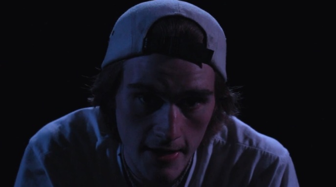
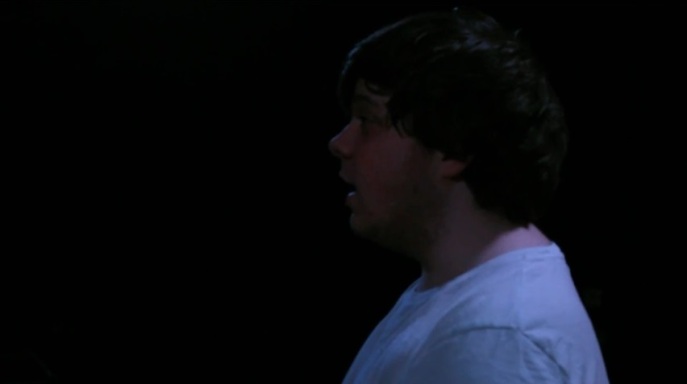
Key Frame 2: This frame is key is because it amplifies the convention of rock music in which, when the lyrics occur, the vocalist is seen, often for the first time.
Key Frame 3
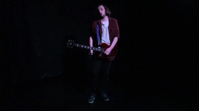
Key Frame 3: This shot presents the use of the generic form of the full body shot apart from the lead singer. This represents Goodwin’s theory of the ‘Treatment of the Star’ in which the lead singer should have close up shots whilst all the other members have full body shots, subtracting the focus of the instrument.

Key Frame 4
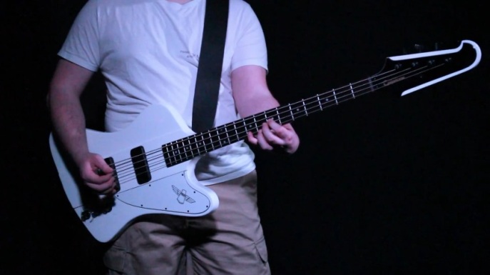
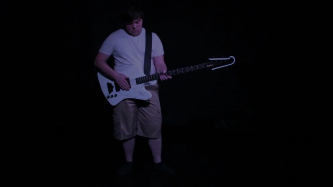
Key Frame 4: This shot presents the conventions of editing to the beat, in which the bass edits to this shot when the bass is heard. It also presents the convention of dynamic shots, the dynamics of this shot is emphasised through the contrast of the black head of the bass against the black background, as well as the white body and t-shirt.

Key Frame 5
Key Frame 5: This frame is important because it portrays the generic conventions of rock music videos of the guitarist. In most rock songs, the guitarist is shows to have a high status and during a solo there are predominantly close ups of the guitar (this is also seen in the ‘miniature solo’ at 1:48)
Key Frame 6
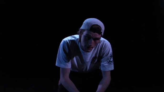
Key Frame 6: This frame is key because it directly conveys the generic conventions of a music video. This frame shows Goodwin’s ‘treatment of the star’ theory by having the lead singer (arguably the most seen and/or important member) in the closest shot. This shot is also key because it directly links to our influential music video director ‘Joel Kefali’ by having the star in the center.

Key Frame 7
Key Frame 7: This frame is important because it shows that there is no full shot of the band, breaking the generic convention. In almost every rock music video, no matter the sub-genre etc., there is almost always a shot of the full band; apart from the video for ‘Madam Erica’ by ‘Hot Chick Banged’ (
).
Key Frame 8
Key Frame 8: This frame is key because it breaks the generic conventions of music videos. Normally; back up vocals are seen playing their instruments, however; in a rock band ‘Skillet’ their video for ‘Hero’ (
) the back up vocalist, who plays the drums, is also seen breaking the convention as she is in shot by herself, much like Gwilym is.
Key Frame 9
Key Frame 9: This final frame is key because it conveys the conventions of music videos in general. The majority of music videos have visuals relating to the lyrics which this fade out is; the lyrics repeat “don’t forget me” and the fade out represents a fade from memory.
How effective is the combination of your main product and ancillary texts?
Comparison


A direct comparison between our main product (the Music Video) and an ancillary text (The Digipak) is the instruments used. In picture A, the guitar is lying on the ground whereas, in picture B, I am seen holding the guitar. This comparison is incredibly obvious because of the prop of the guitar, the same is with the bass and the drum kit. The only difference between these is the mic:


The mic used in the Digipak is not visible in any shot in the Music Video. This is because we decided as though the mic would take away from the shots of Zeph, the lead singer. The mic in the digipak is mostly used as a representative or symbol of vocals as opposed to a prop used in the video.
Ultimately, I think that between the Music Video, Digipak and Magazine advert, they are used effectively together and could be used to promote ‘Canon Fodder’ if they were a real band. This is because both the Digipak and Magazine advert use the same image for the front cover, a full band shot, which whilst not appearing in the main product, still shows all the members which you do get to see. Within the Digipak, the representation of the props used on all four panels shows the individuals that they represent.
What have you learned from your audience feedback?
Survey
A post-video audience feedback survey presented some interesting data:
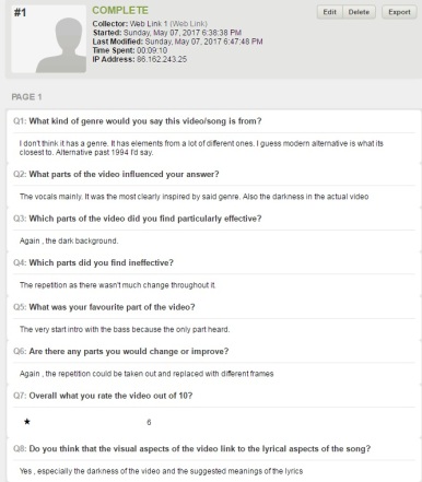
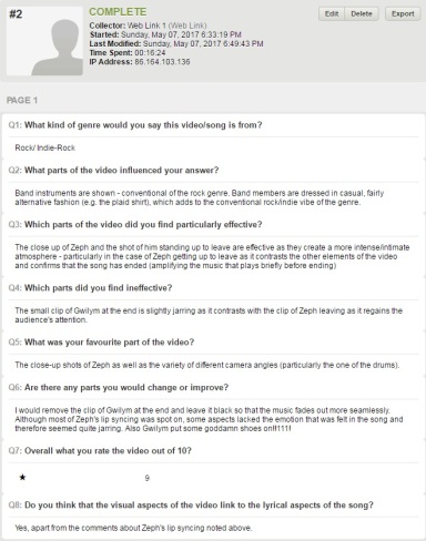
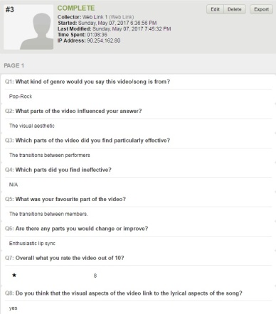


The survey drew in results that the genre was some form or rock which the ‘Red Hot Chili Peppers’ are; they are in fact alternative-rock. The results showed that the majority of favourite aspects of the video were the shots or transitions used, i.e. the third result said “the transitions between members”.
Ultimately, I have learnt that the most important change we could have made was that a coherent narrative arc could have been more effective, to which we would have created one if not for the time restraints due to the change of song and idea.
How did you use media technologies in the construction and research, planning and evaluation stages?
Reflection
By far, the hardest part of this process was the editing. For editing we used Adobe Premier Pro CC:

Personally, I find this software very easy to use. Premiere has a feature that allows the user to move clips around frequently as opposed to ‘clipping’ to the end or beginning of other clips; this was especially useful when trying to get the vocals to sync. That being said, the editing process was tedious and the hardest part of the editing (during the construction of the final product) was the colour grading of each shot.
The colour grading was done because we wanted a more blue tone to each shot, in the picture above I can bee seen changing the highlights of the shot with Gwilym on bass to best match the picture of him singing back up vocals. In this picture I have not adjusted the shadows which is why it seems brighter.
During the construction of the Digipak and Magazine Advert, we used Adobe Fireworks  in order to create the logo and to put it all together. For the band name logo we downloaded the font ‘SummerFestival’ and used that and the rest of the Digipak and Magazine Ad we used the font ‘BIRTH OF A HERO’; we got these from http://www.dafont.com. We thought these fonts worked best because it presents the Alt-Rock genre best and the ‘SummerFestival’ being eroded fits the theme of fading away and being forgotten. Fireworks was the best software we could have used for this because it was easiest to use as opposed to photoshop which is very technical.
During the planning process, however; the only use of technologies used were Gwilym’s phone to take pictures of specific aspects on. For example when we found an empty room with a whiteboard, when completed we took photos (this was pre-change for the ideas for ‘Miss America’). We also discussed some shot types on the whiteboard about what kind of shots we should use in the video (this was done for both videos). The reason we used a whiteboard for a lot of the planning as opposed to a digital mock up software was because we felt more comfortable using it and due to its size were able to easily visualise what ideas we wanted or needed.
Ultimately, I found the lack of media technologies during the planning stages much more effective than if we had used them. This is because due to our change of song and idea we didn’t have too much time to think of an idea (whilst we already did have one, it obviously needed to be expanded upon), and due to the two of us being able to better visualise on a whiteboard, the ideas came together much quicker due to it’s physical size.
This is the promotional magazine advert for our album ‘Loading Compassion’:
This is the digipak for the album: ‘Loading Compassion’ by our fake band ‘Cannon Fodder’:

Digipak with panels names and guidelines

Our Digipak without the guidelines
On this digipak we decided to create our own track names, bar the name of the song we created the video for. The made up tracks are: ‘Insertion Interior’, ‘Catapult Until Overdrive’, ‘California Cream’, ‘Heaven’s Flaw’, ‘Explosive Optimism’, ‘Track of Indecision’, ‘How to Fake Realism’, ‘Mutual Terrorism’, ‘Lacking Creativity’, ‘Eventual Sunset’ and finally ‘Sin is Sexy’. These fake tracks are intended to be names that ‘Red Hot Chili Peppers’ could use, particularly ‘California Cream’ due to many of their songs being about California, e.g. ‘Californication’ and ‘Dani California’
These are the best photos that we have taken for our digipak cover and magazine advert.


Gwilym and I decided that a picture of the band best relates to the genre, considering in Rock there is either artwork or a picture of the band (i.e. for the magazine advert as I’ve examined in my study of them, the Stereophonics’ magazine advert:
Here, the band are all clearly visible and by the clothes they are wearing you are able to tell that they are an Alternative Rock band.)
Finally managed to film the missing ‘miniature solo’ from after the second chorus. This was the only piece of missing footage that we have now finally got.
Editing is well underway, as is the digipak. For editing we need to film a few more clips (re-films) before we can complete the edits.
As for the digipak; we need to get the front and back cover pictures before it can be completed.
Gwilym has now begun work on editing the photos for the digipak; whilst that’s occuring I’ve been getting on with the editing. Trying to set up a time that we’re able to re-film some clips due to lighting differences.
We also took pictures of the band members and instruments after we had filmed so that we were able to maximise our time as well as use our time more efficiently
Editing has begun! I have begun editing the first minute or so: [Insert Screen Cap]
We have also been able to finish filming the vocals (including backing vocals).
We managed to film the drums to completion from multiple as well as get a picture of the drummer. As well as this, we managed to get a few shots of Zeph, the singer; however the camera ran out of battery part way through recording so we will have to reschedule.
